NightSearcher
A UK based lighting manufacturer, with offices in UK, Hong Kong and Poland. Products were a mix of those sourced from China and some made in the UK. The main challenge NightSearcher had was the consistency of brand with up to 5 different variations of the logo across 80+ product packaging pieces. The brand had little to no recognition by customers and very little brand marketing presence due to an outdated website. Poor colour choices of the logo on dark product packaging backgrounds made it difficult to read and a challenge to stand out when on the shelf. See the before and after work taking NightSearcher from a very disjointed messy, cheap look brand into a cohesive set of products being in stocked in Screwfix, Toolstation and RS Components.
Brand development
A fresh logo was created and there was a complete removal of all previously created logos across all 80+ products, including packaging, videos, websites, technical data sheets, brochures, leaflets, business cards and stationery.
Product launches
New E-Commerce Websites
New Custom Packaging Projects
Handled global packaging and localisation for Distributors.
Brand Values & Vision
New Logo
The new logo was central to the rebrand and required a bold new design which reflected the modern technology and provide consistency across the products.
Driven by Data
The new website was formed from Analytics and web tracking insights to improve customer purchases and improve SEO and PPC campaigns.
Strategic Partnerships
Creating custom packaging projects for clients was an ideal way of extending our reach and partnering with those companies with operational bases in the countries like South America, France and America.
Video
Video was key in showcasing the benefits and really lifting the brand image.
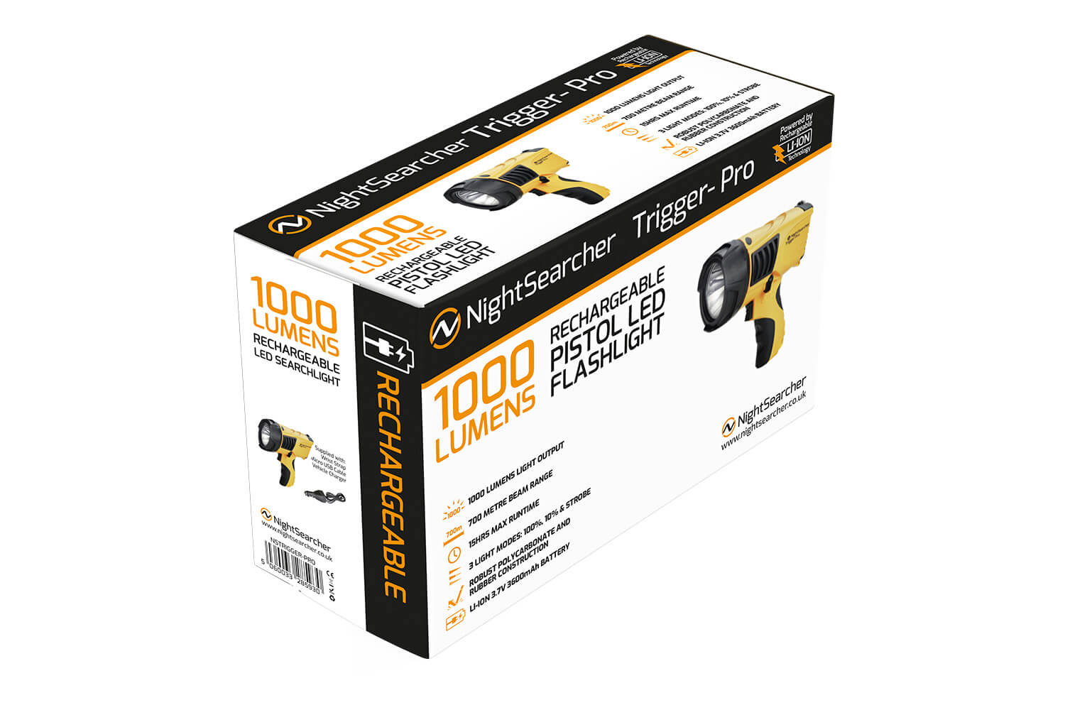
Product Packaging
Packaging was the key motivator in creating products that popped when on the shelf, consistency when products were side-by-side was important as the brand was very disjointed before.

Consistent Brand Image
The new logo was central to the rebrand and required a bold new design which reflected the modern technology and provide consistency across the products and marketing collateral.
The N and S in the logo mark come together to make an emblematic logo, that works well in various sizes, colours and in black and white.
Product Packaging
New products were often brought into the portfolio with short time frames. The projects included managing printers in China to deliver projects to specification and to the quality required. Communication and translating technical information was often a challenge and proofing was key to ensuring perfect packaging.

Professional Video
Video had been not been prioritised previously and often shot poorly making the product look cheap. It didn’t reflect the product functionality or it’s premium features and benefits. Illustrations and animations simplified the products capabilities especially useful for different language adapations.
Product Video
The original video didn’t meet quality standards and failed to effectively communicate the product’s strengths. Switching to a format that uses clear illustrations and animations helped convey its capabilities more accessibly, especially for international audiences. Additionally, producing high-quality, engaging content with relevant links supports stronger SEO performance by increasing visibility and improving search rankings.
